
- Projects
WeExplore


Background
WeExplore is a mobile app that aims to make it easy for outdoor enthusiasts to discover, plan, and share their adventures with a community of like-minded people. The app features personalized recommendations, trip planning tools, and social sharing features. WeExplore is designed to help users discover new places, connect with other outdoor enthusiasts, and make the most of their time in nature.
Project Duration:
My team:
Users:
- Photographers
- Locals
- Tourists
Tools Used
- Figma
- Adobe XD
- Adobe Illustrator
- Adobe Lightroom
The Problem/Challenge
Problem Statement
- How Might We" (HMW questions) - HMW provide an experience where users can look up lots of types of information in a package that is convenient and easy to use.
- HMW provide ease of use and find information, and level of details for a wide range of users.
- HMW get more users to go out and explore many popular and hidden locations around the SF Bay Area.
Solution
Put all the information of different types of locations – photo spots and scenic locations, all into one useful and convenient mobile app on the go. Not only providing different types of location in one app, but giving important information and detail that users need when they go out to explore that location.
Phase 1 : Research
Research on Bay Area locations, via google search and google maps. Then research on prior arts and rival apps on the market. I would compare and contrast, as well as look at the comments users write up about the app to make judgement. Another phase of this part is that I would also conduct interviews. The interviews were conducted through phone calls or video calls, with three potential users. In this part of the process, was where I would scout out the locations and take photos to use for the project. I would also take notes of the surrounding areas of what is notable and vital information that users may need to know when coming to the place.
Competitor Analysis
Explorest
- Accessable offline; users can save locations
- Know nearby attractions and places of that location
- Photo shooting tips
- Real-time weather data and information of that specific location
Google Maps

- Star Saves
- Location & sharing
- Pins for “your places"
All Trails

- Browse photos and reviews submitted from other users
- Record your own hiking trails by using your GPS
- View your hiking, running and cycling stats
- Ability to share on social media with friends and family.
Personas
The point in creating Personas
Personas A, B, and C are representative users that we identified for the WeExplore project.

Persona A
Lorem ipsum dolor sit amet, consectetur adipiscing elit. Suspendisse varius enim in eros elementum tristique. Duis cursus, mi quis viverra ornare, eros dolor interdum nulla, ut commodo diam libero vitae erat. Aenean faucibus nibh et justo cursus id rutrum lorem imperdiet. Nunc ut sem vitae risus tristique posuere.
- Goals:
- Frustrations:
- Must haves:

Persona B
Persona B: Meet Kelly, a 22-year-old digital nomad who loves to travel and experience new cultures. She's always connected to her phone and uses it to navigate new cities, find local hotspots, and connect with other travelers. Kelly is a budget-conscious traveler who enjoys discovering unique experiences and accommodations that align with her values, especially those that are environmentally sustainable. Kelly is also a dog lover who enjoys taking her shiba inu, Pumpkin, on new adventures, including exploring new hiking trails.
- Goals: Have an all-in-one app the can provide a good concise description information for places around the Bay Area in which we can also take her dog along
- Frustrations:
- Must-haves: GPS tracking, Reviews, Tips and advices,

Persona C
Persona C is a solo traveler who seeks authenticity, affordability, and social connections through travel.
- Goals:
- Frustrations:
- Must haves:
By developing these personas and understanding their needs, preferences, and pain points, we were able to design a user-centric platform that caters to different types of travelers and enhances their overall journey.
Flow Chart

Devising the flow chart was to help brainstorm the skeleton of the mobile app. Figuring out the format of each screen. Which button actions link to what screen. From there where would the user go to find their information.
I wanted the create the app to be easy and straightforward for first time use. Therefore, once they appreciate the convenience of using the app they would go back to using it. The app starts with a login screen or quick login (if the user chooses to) then loads to the two categories of the locations they can choose. After that will pop out the list of different spots where the user can scroll through and look for one they are interested in.
User Journey Map

Purpose of this flowchart
Taking some insights from the interviews then forming rough ideas of how personas would look. Which then I base off what would be the experience "the user" endeavors through their journey during the use of this mobile app. The steps I came up with to get a rough sense of how the user would behave with their use of the apps as follows:
- awareness of their problem
- consideration of the potential solution to their problem
- service where the users tests the app and lastly
- the user realizes that the app helps their problem in search for a scenic spot
Phase 2 : Brainstorm
Sketches
Lorem ipsum dolor sit amet, consectetur adipiscing elit. Est, facilisis aliquam fermentum nunc diam blandit in mauris facilisis. Eu et, in pharetra, placerat fusce nullam. Faucibus justo nullam ultrices nisl sed fringilla orci nulla. Placerat facilisis facilisi risus vestibulum odio.


Explanation
Coming up with the sketches, I would draw out initial ideas on how the mobile app looks. A rough sketch on what each screen would look like and what features should be included. After coming up with multiple rough sketches, then comes the low fidelity wireframes. Which are the rough sketches but in digital form.
Phase 3: Prototyping
Low-fidelity
Lorem ipsum dolor sit amet, consectetur adipiscing elit. Suspendisse varius enim in eros elementum tristique. Duis cursus, mi quis viverra ornare, eros dolor interdum nulla, ut commodo diam libero vitae erat. Aenean faucibus nibh et justo cursus id rutrum lorem imperdiet. Nunc ut sem vitae risus tristique posuere.

- This is some text inside of a div block.
- This is some text inside of a div block.
- This is some text inside of a div block.
Designing the prototype. Building off on the low fidelity wireframes, I continue adding more design elements and start detailing the features. The focus and addition of animation of the screen and elements was included too. Taking feedback from the midterm class presentation and additional feedback from user interviewees. I took out previous design elements and changed the layout to look more visually appealing and information focus design. This was the most challenging part of the process, where I would constantly find myself stuck on which design to go with. How I would like the button to go here and what the layout should look like, I would keep referencing off other apps to see if it would be appropriate if my design worked.
Version 2: High Fidelity
Lorem ipsum dolor sit amet, consectetur adipiscing elit. Suspendisse varius enim in eros elementum tristique. Duis cursus, mi quis viverra ornare, eros dolor interdum nulla, ut commodo diam libero vitae erat. Aenean faucibus nibh et justo cursus id rutrum lorem imperdiet. Nunc ut sem vitae risus tristique posuere.

- This is some text inside of a div block.
- This is some text inside of a div block.
- This is some text inside of a div block.
Phase 4: Revision
I presented the 1st prototype to the class. After getting feedbacks for the first draft of the prototype mockups. I went back to the drawing board to revise the color scheme to making the overall layout more consistent with the design. The button and elements are more closely related to look and overall feel. I fixed how the icons would be perceived by the user by adding different color depth which will highlight what that icon/button does. This revision I wanted to make it clearer for the user to distinguish what the screen they are looking at. The different locations are colored coded to their respectful categories.
Version 3: High Fidelity
All the screens

Heading
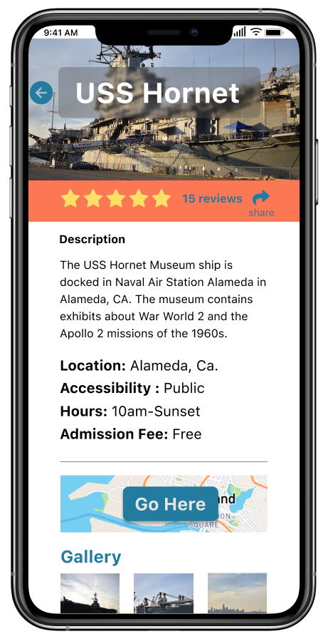
This screen shows the location information with all the details of the description about the location. The hours of opening and closing time of the place. Whether the location is admission free or not. In this screen the user can click on the "Go Here" button which will redirect them to the navigation screen.
Heading
This screen shows the location information with all the details of the description about the location. The hours of opening and closing time of the place. Whether the location is admission free or not. In this screen the user can click on the "Go Here" button which will redirect them to the navigation screen.
Scope and constraints
Covid-19 situation
- Closing of many locations (parks and scenic spots) – resulted in design change to the mobile app and the lack for detailed for some of the locations. The closure of many of these spots hindered the research and data needed to be implemented into the design.
- Another constraint of the situation prevented interaction with users in person. This issue prevented me to conduct in-person interviews and in-person user testing. (ideally with researching for the project would require me to get better feedback and research when it comes to interacting how users would interact outside in those locations to get their feelings and reaction.

Takeaways
- Given the change in the design process and the overall production. DIfferent steps were changed, where the main important part is the adjustmentof the work project development schedule. The delay of working on different parts of the project affected the outcome of how the project came to be.
- The change to the goal would be instead of focusing too much on the research into what design style fits or works the best. Or what features will be appropriate. I should have taken user input more seriously from the start. I got into the interview/research phase a bit too late in the work schedule.
- The change to the 1st step phase would be to come up with initial design ideas and then conduct research/interviews to get a better sense and feedback on what works. Instead of taking a longer time deciding and going back and forth with the research.
- The main change in the work timeline, was putting the emphasis on getting work done sooner. Being that this project was big, it would have been better to split the work tasks into smaller chunks and work on it gradually for better time management and improved results.
.png)