
- Projects
Zachary's Website
March 2019 – May 2019
Overview
A redesign of the popular local Pizza chain located in the East Bay, CA. Taking what is lacking in the old website and modernizing it

Role
Team
Platform
Problem State / Design Challenge
- Menu and layout are confusing and cluttered
- Too many elements on one page competing for attention
- Too many similar web pages with similar information
- The brown and gold color scheme does not convey the correct brand language
- Overall styling of website is dated and unappealing
- Ordering user flow is overcomplicated
Current Website

Solution
Update dated-looking aesthetic by:
- Utilizing full screen width
- Rethinking use of color
- Simplifying layout
- Making brand identity consistent throughout site
Make site more user-friendly by:
- Simplifying system architecture
- Making necessary info easy to find
- Having a clear action that users can perform (Order button)
.png)
.png)


Process
What is the brand?
"Zachary's provides award - winning pizza to loyal customers in a lively, rustic environment with a community - oriented voice, helping them feel warm and be satisfied."
The Client's Needs
The client has one bottom line; money. To target customers effectively they need a website that provides restaurant locations in a simple and upfront manner, an easy to use online ordering system, and lots of informations about their food and restaurant that gets the customer interested.
- Pizzeria locations are clearly shown
- Easy online ordering
- Menu items are quick and easy to understand
- Pictures on website to display quality food and friendly atmosphere
- Awards, arts, and merchandise are showcased.
Scope and Constraints
Lorem ipsum dolor sit amet, consectetur adipiscing elit. Suspendisse varius enim in eros elementum tristique. Duis cursus, mi quis viverra ornare, eros dolor interdum nulla, ut commodo diam libero vitae erat. Aenean faucibus nibh et justo cursus id rutrum lorem imperdiet. Nunc ut sem vitae risus tristique posuere.
Site Architecture

Style Tile
- Warm, inviting color palette with a hint of sophistication
- Marker-like header font mimics Zachary's logo and gives a rustic, playful vibe
- Subhead/paragraph font provides readability at smaller size

Research for inspiration and references to build a comprehensive style guide to build off of.
User Profile 1
Bob Everyman: Regular Customer
- Age 38
- Upper-Middle Class
- Financial Analyst at Pandora
- Married
- Two Children, 8 and 5
User Profile 2
- Age 27
- Lower-Middle Class
- Freelance Graphic Designer
- From Kansas City, Missouri
- Visiting family in Oakland
Sketches: Home Page
Lorem ipsum dolor sit amet, consectetur adipiscing elit. Suspendisse varius enim in eros elementum tristique. Duis cursus, mi quis viverra ornare, eros dolor interdum nulla, ut commodo diam libero vitae erat. Aenean faucibus nibh et justo cursus id rutrum lorem imperdiet. Nunc ut sem vitae risus tristique posuere.
.jpg)
Wireframe: Home page

Lorem ipsum dolor sit amet, consectetur adipiscing elit. Suspendisse varius enim in eros elementum tristique. Duis cursus, mi quis viverra ornare, eros dolor interdum nulla, ut commodo diam libero vitae erat. Aenean faucibus nibh et justo cursus id rutrum lorem imperdiet. Nunc ut sem vitae risus tristique posuere.
Sketches: About Page
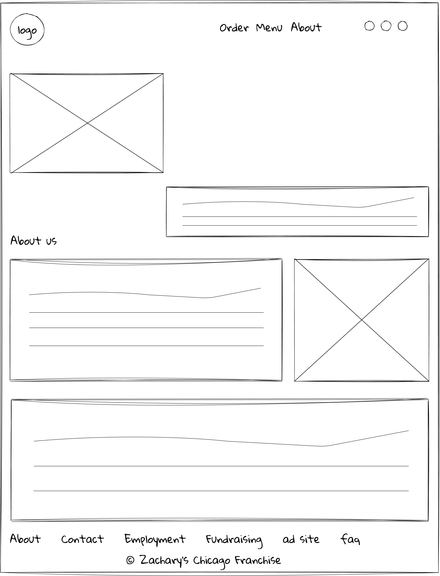

Wireframe: About Page


Sketches: Menu

Wireframes: Menu

Reflection
Lorem ipsum dolor sit amet, consectetur adipiscing elit. Suspendisse varius enim in eros elementum tristique. Duis cursus, mi quis viverra ornare, eros dolor interdum nulla, ut commodo diam libero vitae erat. Aenean faucibus nibh et justo cursus id rutrum lorem imperdiet. Nunc ut sem vitae risus tristique posuere.
Finished Website Redesign
This gallery uses our lightbox element, which lets you display images or videos inside an immersive, fullscreen slideshow. Double-click the placeholders to replace them with your own images (or videos).